Fallen
Coca - 2008
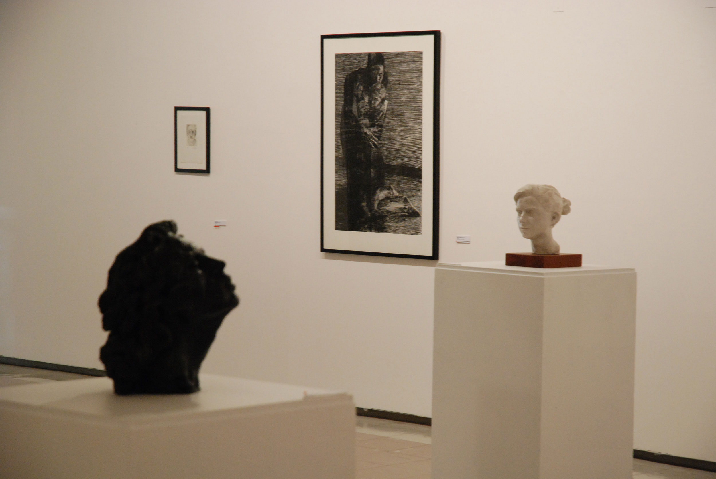
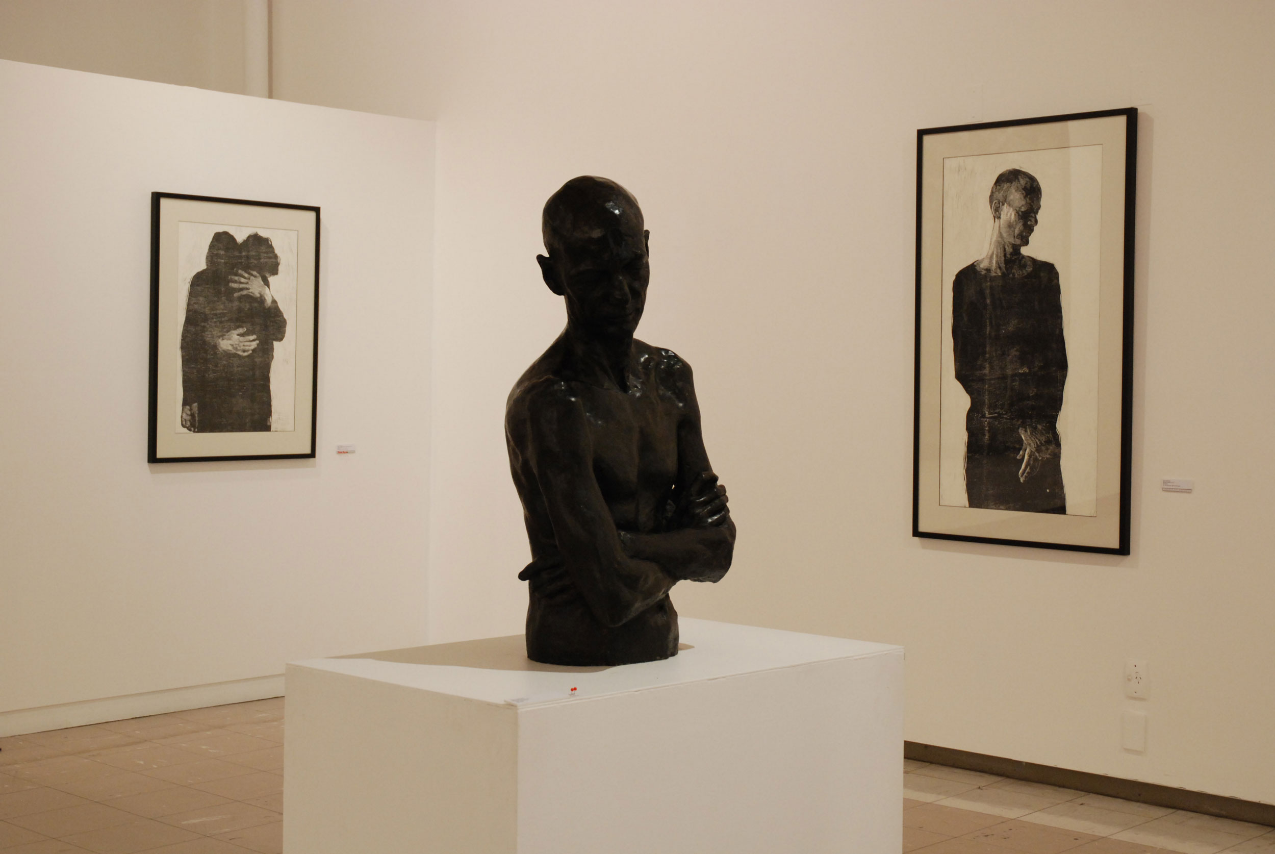
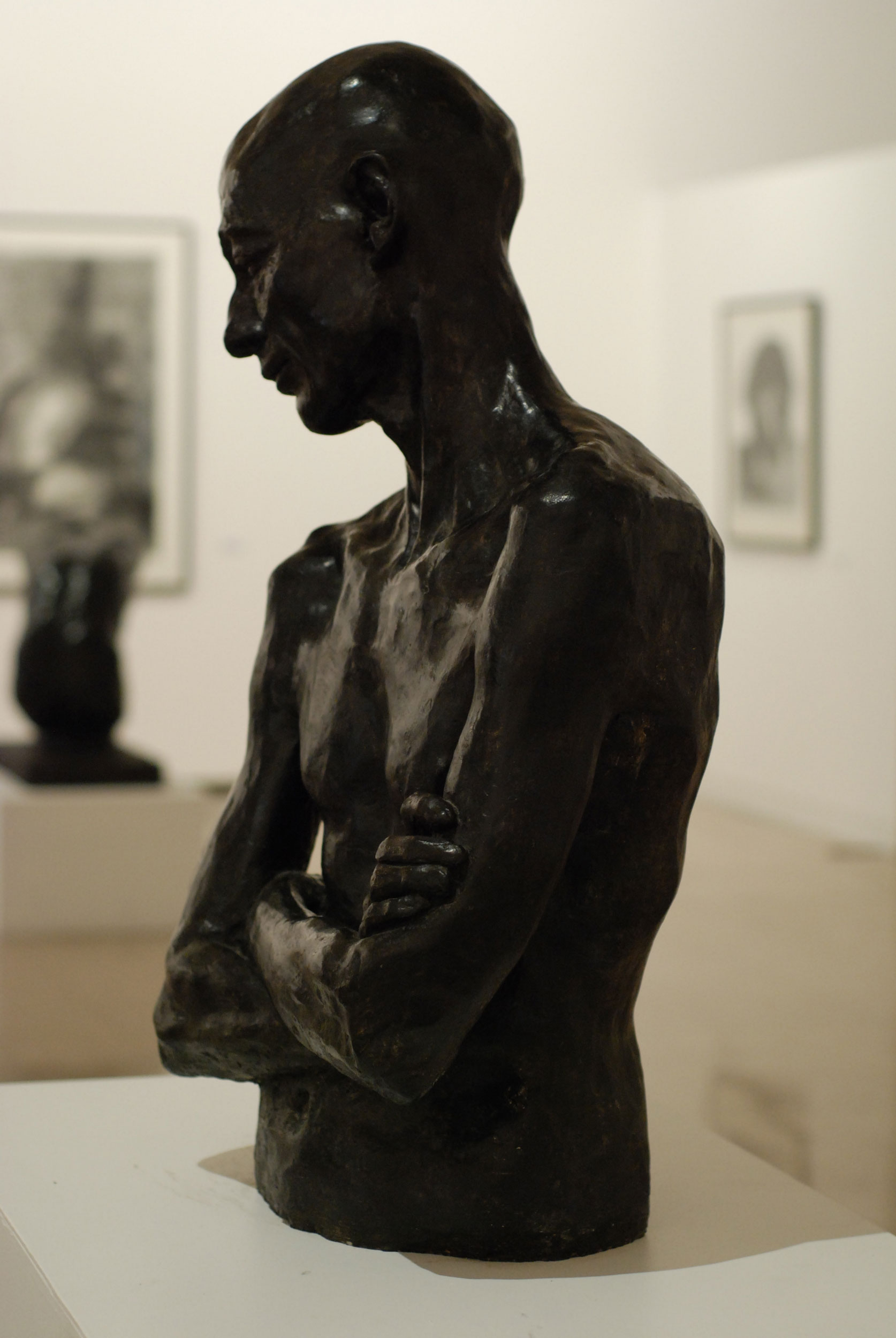
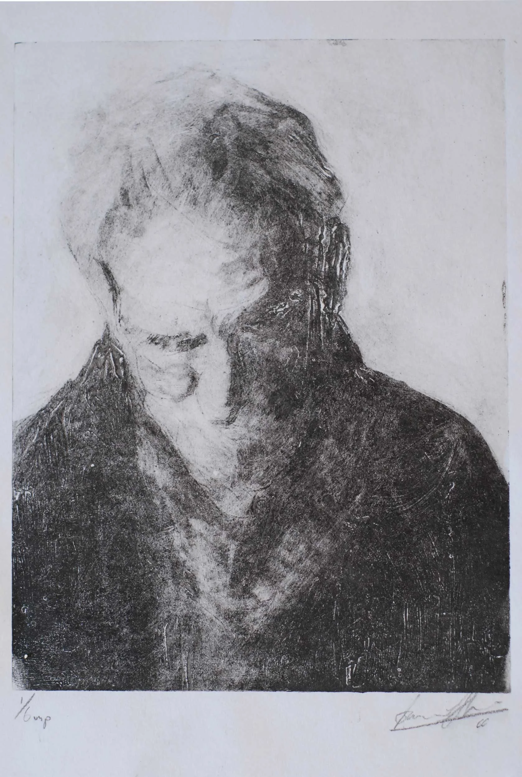
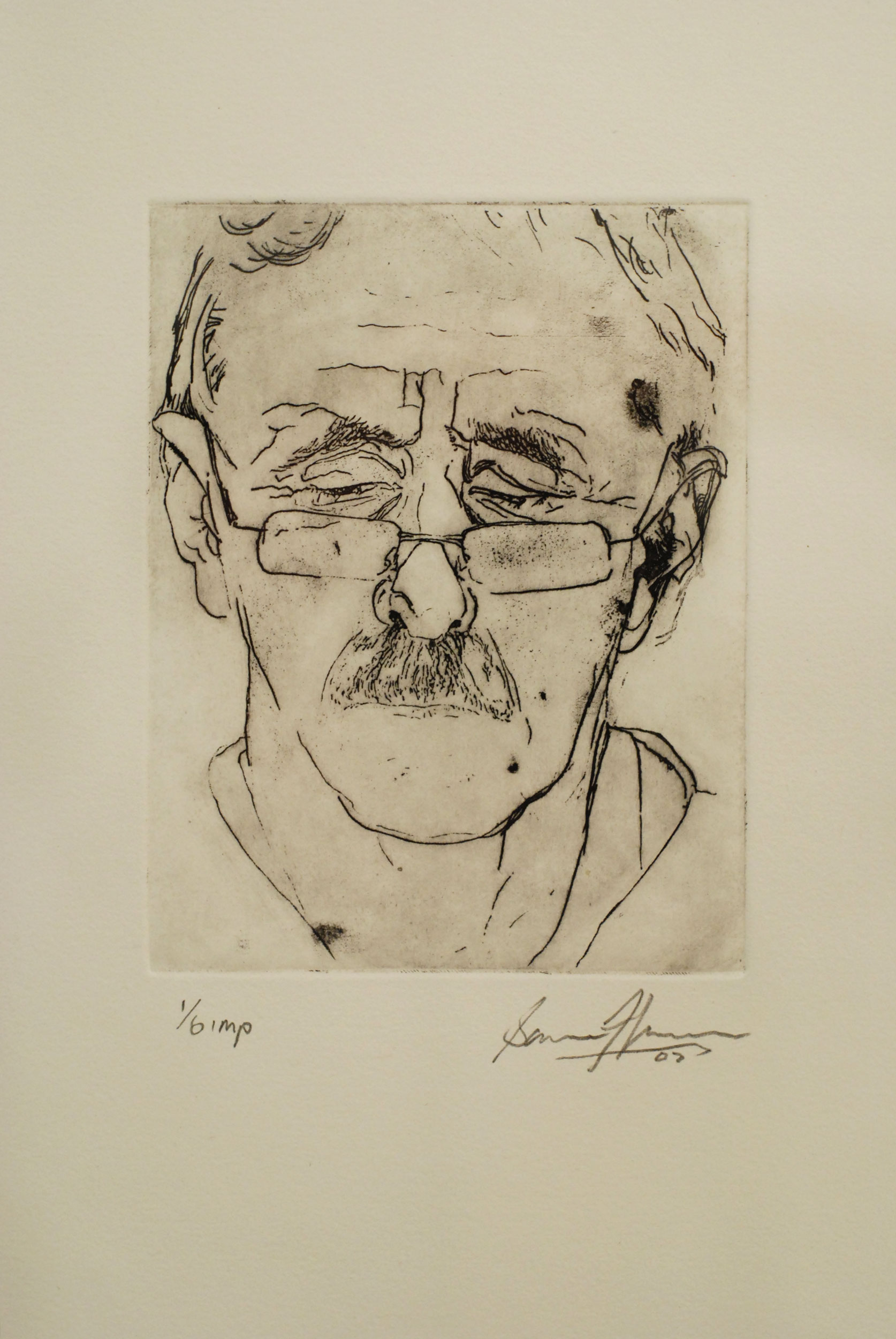
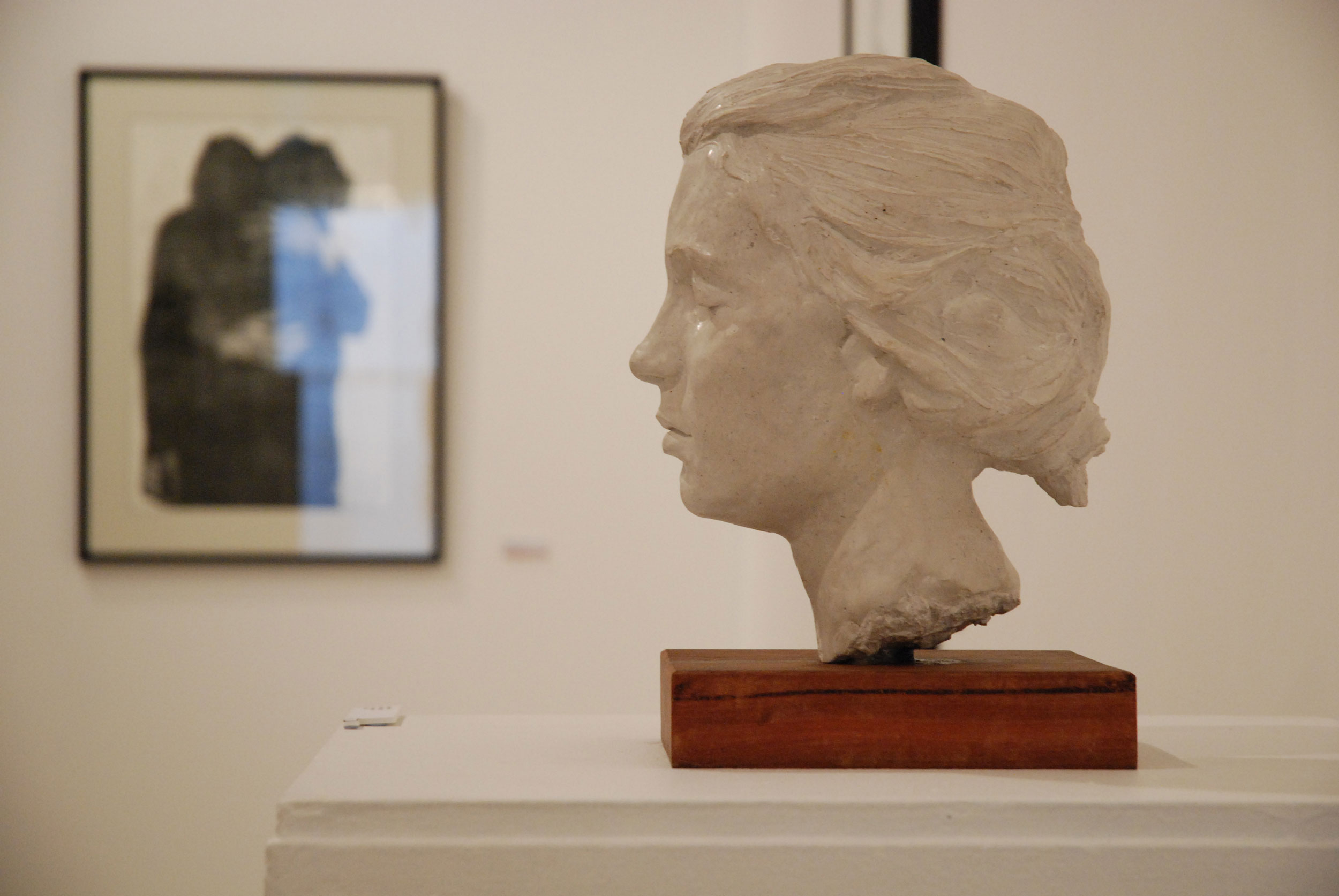
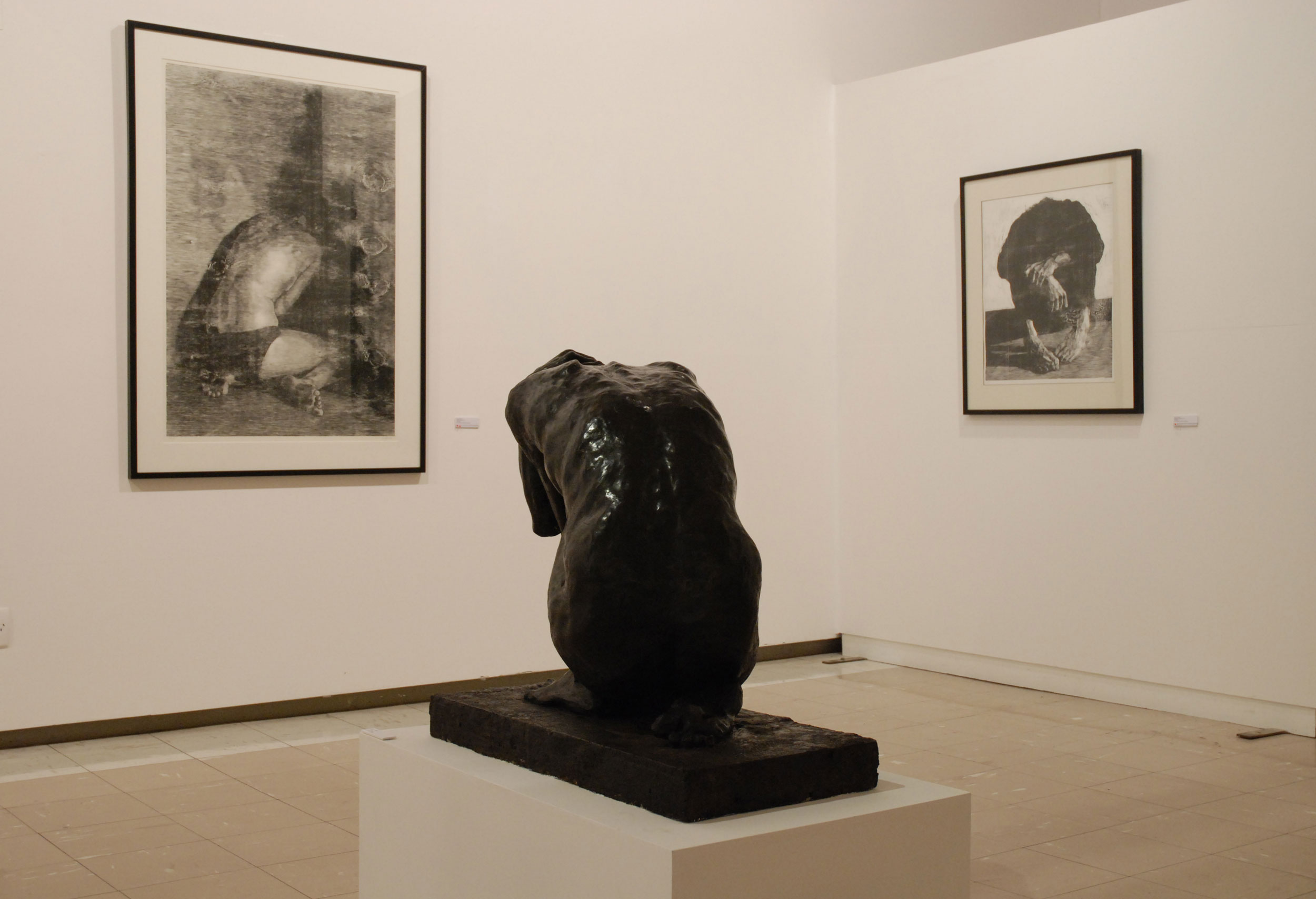
Fallen, Sam Harrison’s March exhibition, surprised many of COCA’s visitors familiar with his work, in the first instance, it was a mature and consistent body of work for a young artist, with an impressive and subtle dialogue established between printmaking and sculpture. This was not immediately evident in its underlying imagery of portraiture, and in Harrison’s confident manipulation of materials and dramatic contrasts of light against dark.
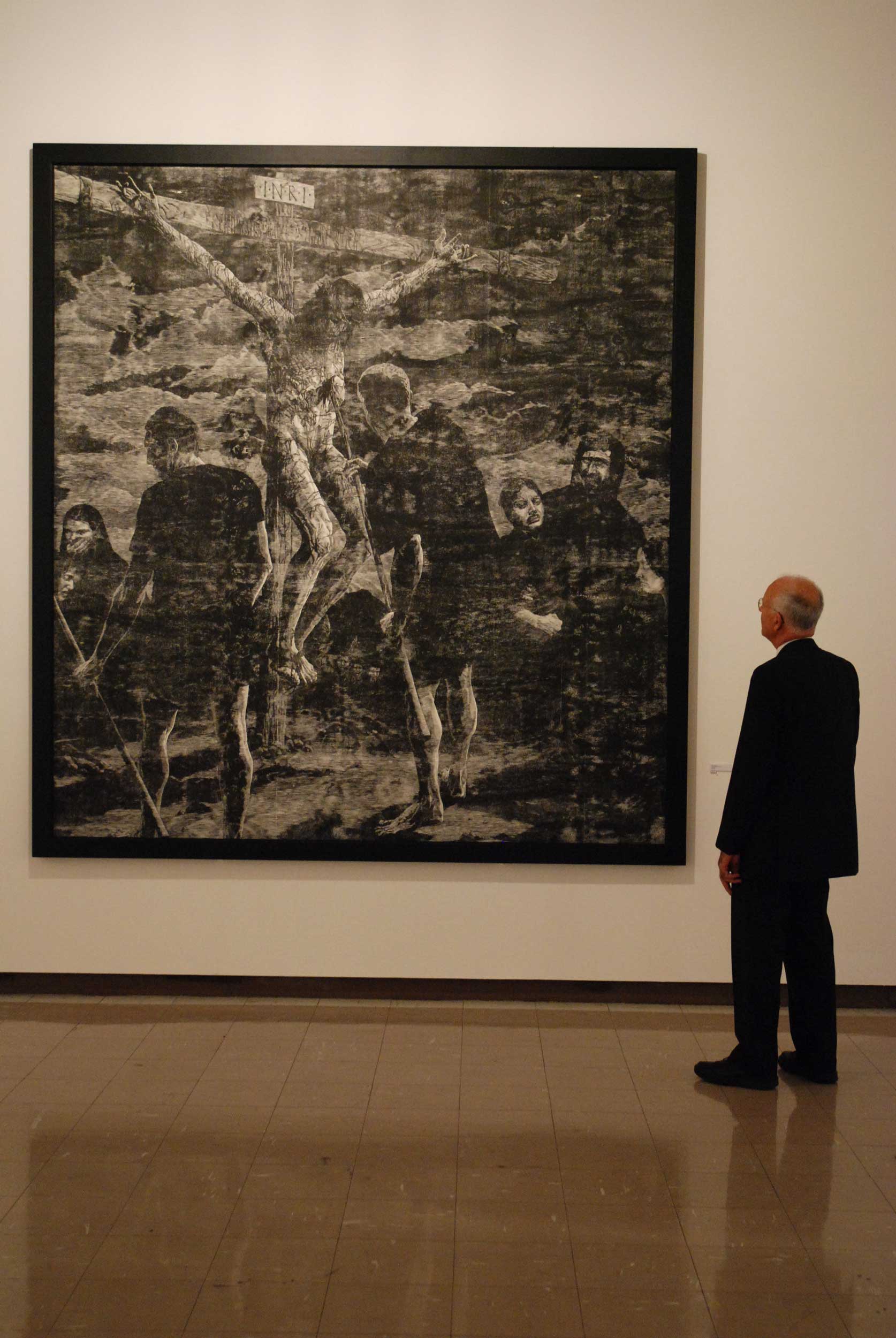
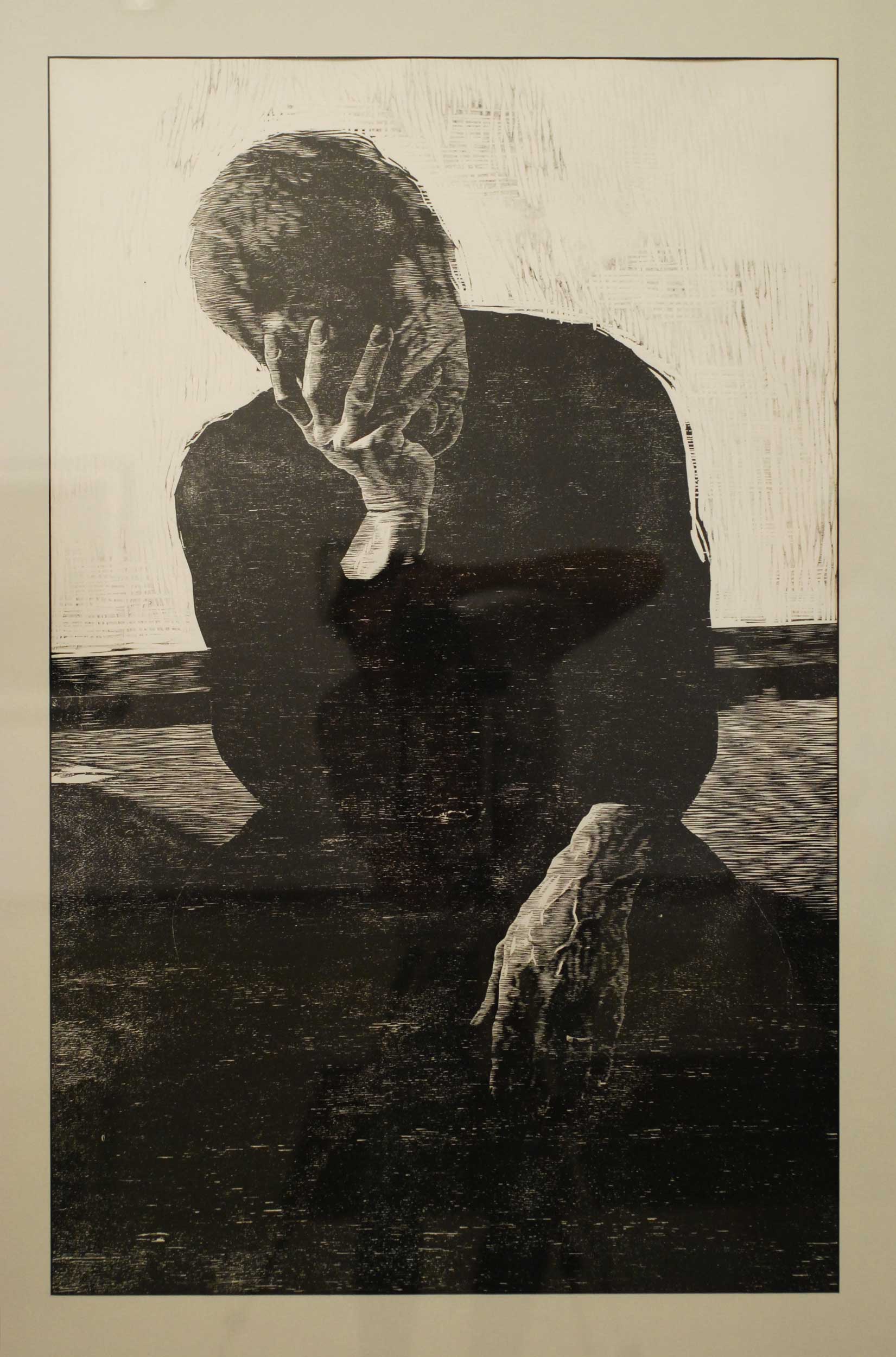
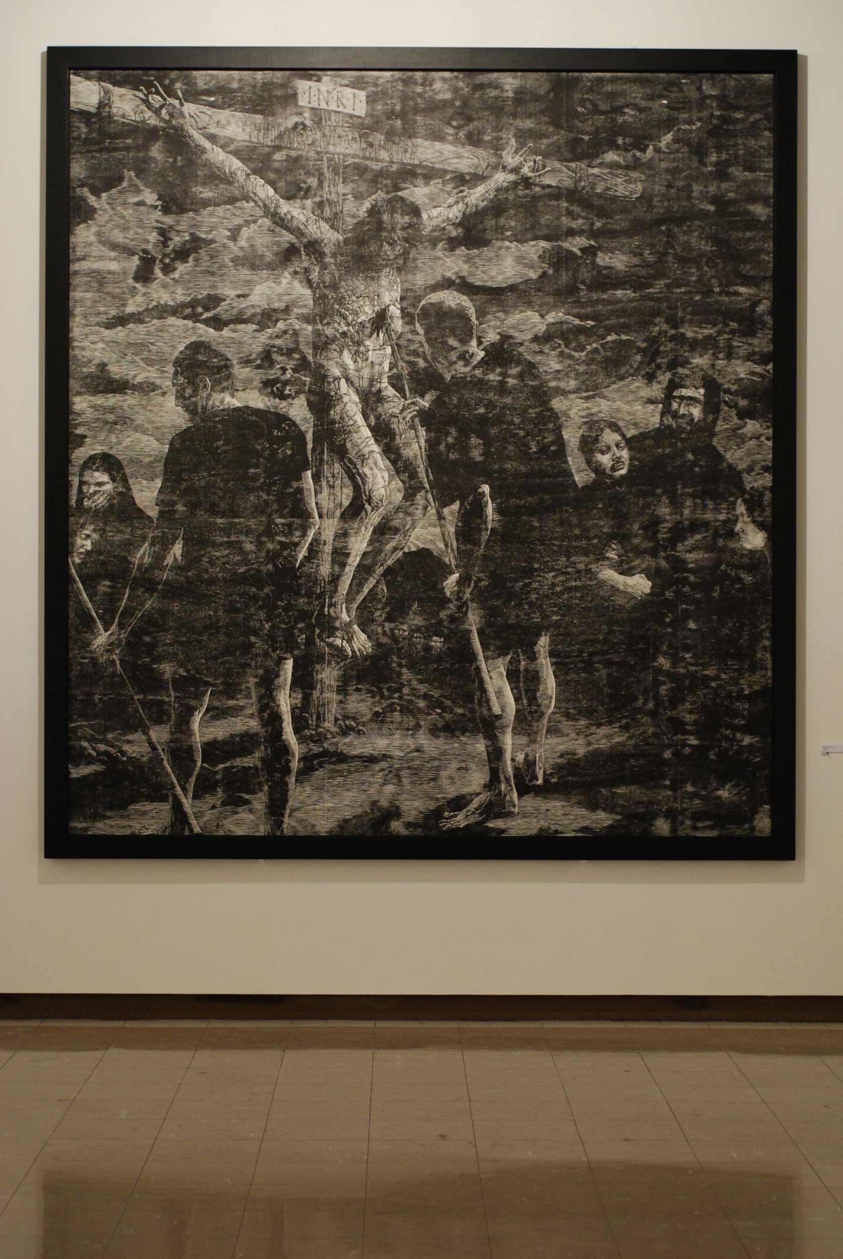
However, the public response to the large-scale woodcut Crucifixion (at 3 metres by 2.8 metres – is this the largest woodcut ever made in New Zealand?) was both affirmative and negative. The ambitious nature and monumental scale of the work impressed., and this was consolidated by Harrison’s confidence in crafting the work. One visitor, standing close to the image, and taking in the beautifully printed surface, commented that he did not care where this was placed in either Harrison’s oeuvre or New Zealand art in general; it was simply an art object of considerable aesthetic quality that he was pleased to take in. Others were less complimentary and raised questions about the context of an art work that seemed to appropriate the High Renaissance imagery of Northern Europe, with little regard for, or awareness of, post-modern irony in New Zealand in 2008.
Certainly, Crucifixion did not appear to be a bit like the woodcut that Albrecht Durer had kept hidden from public view, which had suddenly re-emerged on the other side of the world more than 480 years later. Why did this work seem out of step with other images in the exhibition? After all, High renaissance imagery (from both Italy and Northern Europe) was predominant throughout the gallery space and was one of the reasons the exhibition was so aesthetically successful. Moreover, Harrison had referenced contemporary images of war and human suffering from television news and magazines, seeking to establish a context for the traditional iconography of the Crucifixion in a current setting. Yet, comments about the work’s failure to locate a place for itself in arts practice seemed, on one level, to be credible.
Or were they?
Following the conclusion of the exhibition, Crucifixion went on to have another life as a finalist in the COCA Anthony Harper Award. It was sited in the gallery space between an untiled watercolour by Kushana Bush and Beverly Rhodes’ Flower Girl VII. Both work retained a particular darkness and decadence that somehow complemented Harrison’s medieval and religious imagery. On second viewing, Crucifixion did not appear quite so out of step with current ideology. The scale, drama and imagery of this work now seemed familiar, suggesting that is was the very ‘newness’ of the work, and the immediate desire to somehow make sense of it by locating it in an art historical canon, that was the problem. Possibly the challenge that audiences initially faced with the work was the reading that they brought to it. Just as the New York Times critiqued the newness of abstract expressionism in the 1950s by highlighting the personal agenda that gallery visitors bring to an art work, those who viewed Harrison’s Crucifixion should not have been asking ‘what does it represent?’. If they felt perplexed by an artwork that seemed to have arrived in the wrong time zone, a more appropriate question may have been what values and principles were they bringing to the work, or to make the point more succinctly: ‘What did they represent?’
By Warren Feeney